Editor's Note: Click the play button to listen to a recently released conversation between hedge fund manager and MacroVoices podcast host Erik Townsend and Hedgeye Senior Macro analyst Darius Dale.
Erik and Darius discuss our Macro team’s top 3 themes for 2Q 2018: USA #Peak Cycle; Global Divergences, Reiterated; and U.S. Dollar #Bottoming?. Below is an excerpt transcribed from the conversation.
* * *
Erik: Darius, the second of your three major themes for Q2 was global divergence reiterated, you’re calling it. Walk us through this series of slides, that starts on Slide 36.
Darius: If jump ahead to Slide 37 – again, at Hedgeye we’re really big on data sequencing and understanding where we are on the growth and inflation sine curves with respect to every major economy. What we show in this slide is the sequencing – every major economy from a Hedgeye GIP model perspective (GIP stands for growth inflation and policy).
The summary of this slide is that 1s and 2s are good. 1s and 2s mean growth that is accelerating. And 3s and 4s are bad from the perspective of growth. That means growth is decelerating. Even if you pull this chart all the way back to the first part of 2016, what you see is that the world has been in a globally synchronized recovery since then. And it’s transitioning to a much more precarious state.
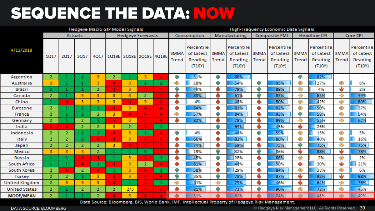
Think about so many major economies starting to peak and decelerate from a rate-of-change perspective. This chart shows what this snapshot looked like from a trending economic data perspective at the year-to-date high in global equities. And with so many indicators trending higher, if you flip ahead to Slide 38, you look backwards and say, well, duh, of course the volatility hit all-time lows.
We had a two-year-long globally synchronized recovery. That’s precisely the environment we should have seen volatility hit all-time lows, which we show on Slide 38 across global equities. And if you think about what’s happening now, we’re starting to see a fairly emergent deceleration in trends across some of these: consumption, manufacturing, PMI, and inflation aggregates. I think that’s really bad. And it’s certainly, from these levels of consensus, complacency to really start to impart a significant degree of financial market volatility to the extent that these nascent decelerations off of peak growth rates really start to trend, as our compared-to-base-effect models suggest they will.
Erik: Darius, as I look at these last few slides, we’re really looking at a number of indicators, data feeds, that are giving you prognostications. And, boy, as I look further to the right everything is looking red. How does that line up with what you’re actually seeing in markets?
Darius: We’ve seen a pretty material step up in volatility. And a pretty material step down in performance. If you look at Slide 40, what we’re showing is all those same global equity markets from a year-to-date performance perspective, and from a 90-day realized vol perspective on a year-to-date basis. Side by side juxtaposed with what’s happened in 2018. And what you’re seeing is a lot of red and some doubling and tripling of volatility – realized vol.
On Slide 41, we show that realized vol on a 30-year percentile basis. What you’re seeing is we’re basically at all-time lows across realized vol or somewhere near all-time lows across realized vol for pretty much most of global equities. Going back to that chart on Slide 22, we’re not coming from an inconsequential point if you think about, one, this globally synchronized recovery fundamentally, but, technically speaking, also all-time lows in volatility. So it won’t take much to reduce risk budgets and force investors to close trades. So this is something that we’re really keying on.
If you look at global interest rate markets, on Slide 42, confirming our outlooks. One of our big calls at Hedgeye is Quad 4 in the Eurozone, i.e., Europe is slowing. We have European growth and inflation trending lower throughout the year. Maybe not in the intermediate term but certainly as you progress to the second, the third, and the fourth quarters.
We’re materially below the Street for Eurozone growth and materially below the Street for Eurozone inflation. And that’s also one of the reasons why we think – if you look at the economic surprise indices for the Eurozone broadly, they’re down at levels we haven’t seen since 2012. And we expect them to stay down at around these levels until consensus gets its act together in terms of no longer straight-lining what had been a fantastic recovery in Eurozone growth and inflation that culminated in Q4. It’s Q2, here, in 2018, so we definitely want investors to be managing the risk that’s ahead of them, not the narratives that are behind them.
Erik: A theme that we’ve heard a lot about from our other guests is the risk if China sees a slowdown or, worse yet, a blowup of their massive credit expansion. It could send shockwaves throughout the global economy. I see you’ve got a sequence of slides here talking about China slowing. Tell us what you see on the horizon here.
Darius: We don’t make grandiose calls from a macro perspective. If you think about any process that’s very data-driven and very data-centric on identifying where you might be on the sine curve for something as simple as growth or inflation – well, I guess it’s not simple, but for something that’s as integral as growth and inflation – the last thing you wind up with is these big bang risk calls.
In fact, I would say one of the betters calls we’ve ever made as a firm is taking the other side of the yuan devaluation in early 2016. But, again, much like Europe and the US, China is kind of in the wrong place from the perspective of its sine curve.
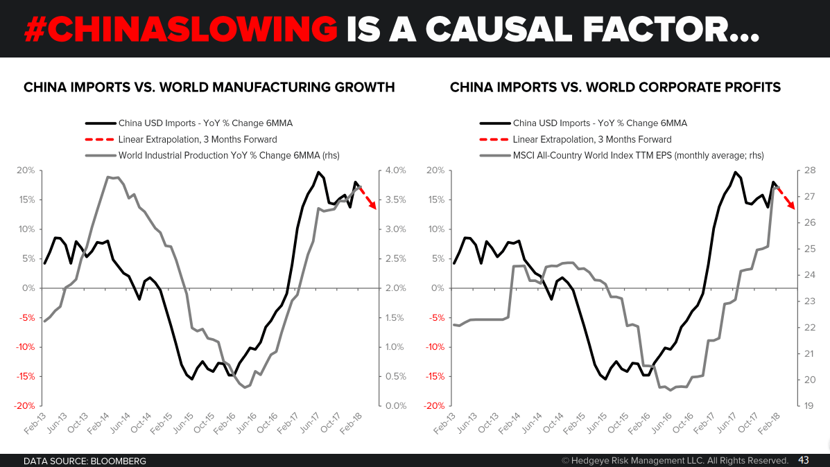
What we show on Slide 43, the whole world effectively responded to the bottoming of the Chinese economy, and the massive acceleration we’ve seen that persisted from the early part of 2016 all the way through the early and mid part of 2017. On the left chart we’ve got global industrial production on a GDP-weighted basis. And then the global corporate profits. And what you see is that everything bottomed on a lag to China and accelerated on a lag to China’s acceleration. Why did that happen?
On Slide 44 – if you go back, I think a lot of investors probably missed this. We definitely didn’t nail the bottom in this. But I think in hindsight – hindsight being 20/20 – you can see exactly why that happened. If you look at the Fed dot plot, the Fed turning dovish multiple times in the latter part of 2015 into peak deflation periods in the early part of 2016. That alleviated a decent amount of the capital offload pressure that we had seen in the Chinese economy because that capped the upside in the dollar from a broad trend rate perspective.
That allowed the PBOC and Beijing to combine fiscal and monetary easing that was at peak – that was basically the biggest easing package that we’ve seen in modern Chinese history, if you combine both the fiscal and monetary impulse that obviously had a pretty material impact on the Chinese economy (which we show in Slide 45). The red line in the chart on the left is really what investors should focus on. Nominal GDP – this is nominal GDP in secondary industries in China: manufacturing, construction, heavy industry – fell to almost 0% by the end of 2015. We would argue that’s one of the causal reasons for deflation. But, again, everything is reflexive.
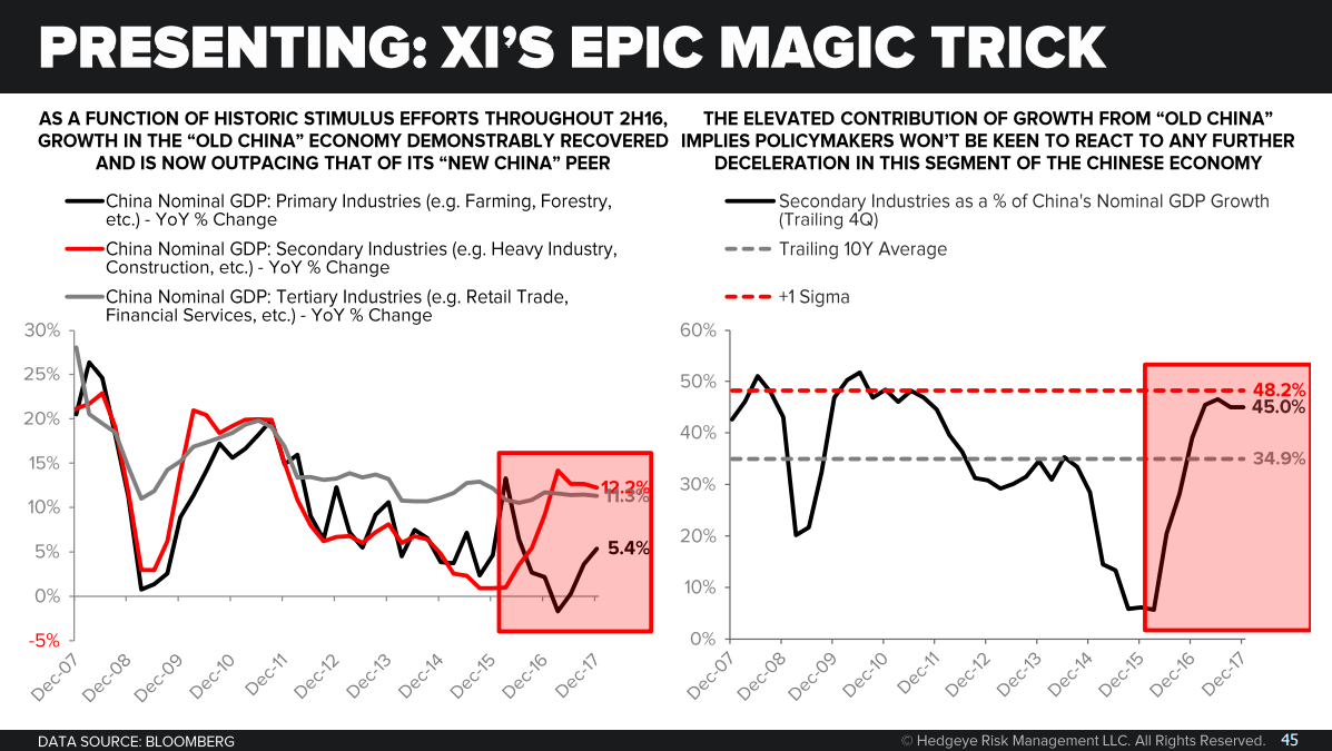
So all that stimulus that Beijing and the PBOC imparted upon the Chinese economy caused that red line to hook up all the way back to 14–15% by the beginning of 2017. What’s important about that is that we’ve gone back to levels of investment growth that policy makers in China have previously identified as a level that creates a tremendous amount of financial instability. So we definitely don’t see them responding quickly to any sort of downturn associated with this, reverting back to some more normalized mean.
We don’t expect it to crash, because we definitely think Beijing is very keen to avoid a 2015-style collapse. That’s certainly something that they have learned their lesson from. We definitely think the impulse of these charts is lower, not higher. And a lot of the reflation we’ve seen over the past couple of years, particularly across emerging markets, has been a direct function of this recovery in Chinese demand. We show that on Slide 46, showing Asian export growth. That chart, much like the global industrial production chart and global corporate profit chart, they all mirror this progression of the Chinese economy on the way.
