

Editor's Note: Below is a Hedgeye Guest Contributor research note written by Dr. Daniel Thornton. During his 33-year career at the St. Louis Fed, Thornton served as vice president and economic advisor. He currently runs D.L. Thornton Economics, an economic research consultancy.
A brief note on our contributor policy. While this column does not necessarily reflect the opinion of Hedgeye, suffice to say, more often than not we concur with our contributors. In the piece below, Thornton asks and answers a key question:
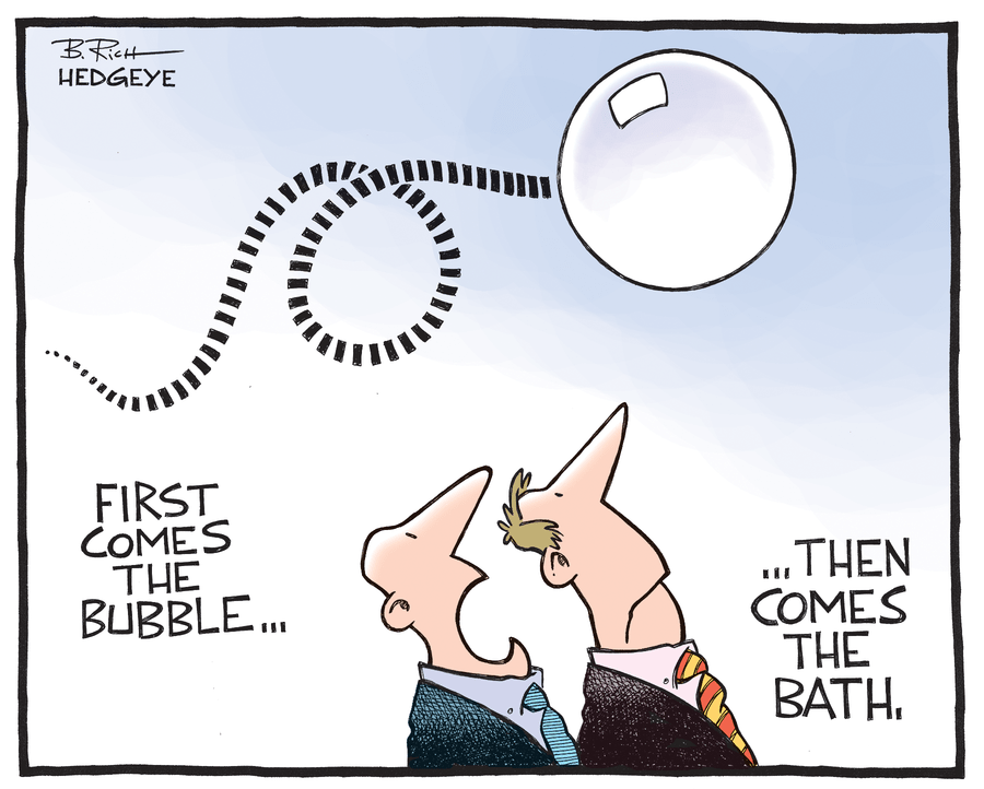
"Are the increases in equity and house prices since the end of the last recession (June 2009) due to economic fundamentals and are therefore sustainable, or are they excessive and, therefore, not sustainable?"
Two readers, an old friend and a friend and former colleague, suggested that the trend line in my graph might be somewhat less scary if I had estimated it over the entire sample rather than the period 1973Q1 to 1994Q4. One of the two also asked why I calculated the ratio using disposable income rather than GDP. Another reader asked whether the most recent rise in household net worth could be due to an increase in personal saving. I decided I should look into these issues. Here’s what I found.
Graph 1 below is the scary graph I presented in My Scary Chart, with a trend line estimated over theentire sample added. The new trend line (red) does suggest that the Dot.com and real estate bubbles were slightly smaller relative to trend. However, there is no meaningful difference for the recent rise in household net worth. I did not choose the 73-94 period deliberately to make things look bad. I chose it because 1973 is about when the series stopped trending down and early 1995 is the when the NASDAQ and other equity price indices began rising more rapidly.

Graph 2 shows the ratio (not in percentage) of household net worth to GDP. The graph is very similar to Graph 1, except the ratio is necessarily smaller because disposable income is much smaller than GDP. Relative to Graph 1, the trend line over the 73-94 period makes things look even more scary than Graph 1. The trend line over the entire sample makes things look less scary, but things still look pretty scary.
These graphs are more scary during the recent period when one realizes that the large increase in net worth occurred during a period of slow output growth: The economy grew at a 2.1% rate since 2010Q1, much slower than the 3.1% rate during the period 73- 94; a period marked by four recessions, two of which were both long and deep.

The most recent period has also been marked by anemic inflation; 1.5% compared with 5.2% for the 73-94 period (the PCE index less food and energy). In short, while the economy and inflation have been muddling along, equity and house prices have been booming—there’s no lack of inflation in house or equity prices.
Let’s see whether it is likely that the recent rise in household net worth relative to disposable income is due to an increase in saving. Graph 3 shows personal saving as a percent of disposable income from 1959Q1 to 2015Q4. The percentage increased from 1959 to the mid-1970s. It peaked at 15% in 1975Q2.
From the mid-1970s to the beginning of the financial crisis, the saving rate declined pretty steadily to about 2.6%. The saving rate then rose to a peak of 9.2% in 2012 Q4 only to fall precipitously to about 5.2% where it remains. The increase in saving since the end of the financial crisis is relatively small and short lived. Hence, it seems unlikely that it resulted in an accumulation of net worth sufficient to account for the 100 percentage point increase in net worth.
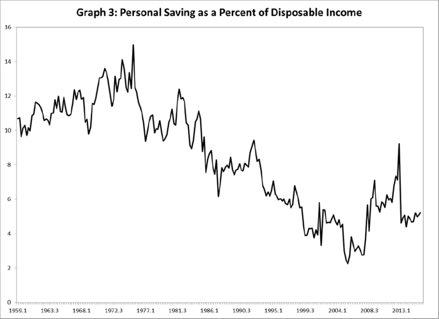
Even more compelling is the fact that the saving rate has decline since the mid-1970s while household net worth has increased. The negative relationship between the personal saving rate and household net worth as a percent of disposable income is consistent with households becoming increasingly leveraged—they borrowed more and saved less. Americans aren’t saving too much—they’re saving too little.
So we’ve learned that no matter how you slice it or dice it, my scary graph is still pretty scary. We know that it is extremely unlikely that the recent rise in household net worth, or for that matter, the previous two rises, were not due to households saving more. We also know what happened the last two times that household net worth rose to such heights. We also know that the recent rise in net worth is largely due to large increases in equity and house prices.
So the question is: Are the increases in equity and house prices since the end of the last recession (June 2009) due to economic fundamentals and are therefore sustainable, or are they excessive and, therefore, not sustainable? Several people have suggested that equity prices do not appear to be “out of line” based on PE ratios or other criterion.
When trying to decide which of these is correct, it is useful to keep in mind that there were people saying the same things in October 1929 and October 1987, and February 2000. Indeed, most were betting that stocks were not overvalued right up to the time when the market crashed.
Likewise, most were betting that subprime loans were not “junk” right up to the time when they couldn’t sell them. The few who were betting they were junk did very well. The truth is that no one knows for sure.
But I believe the most recent rise in net worth is also unsustainable. Here are some reasons why in no particular order:
- House prices have been rising during a period when economic growth is weak, inflation is low, interest rates are ridiculously low, and the Fed’s theoretically flawed QE policy (see Requiem for QE) helped keep the housing stock from adjusting completely.
- The Fed’s zero interest rate policy has distorted the allocation of economic resources and incentivized excessive risk taking.
- The rise in net worth is being driven by a rise in asset prices, not by an increase in real capital. I see no way for the net worth to remain at its current level, let alone increase beyond this level.
Conclusion: Household net worth as a percent of disposable income will fall back closer to, if not below, trend. The question is: Will it fall precipitously as it did in 2000 and 2007, or will it decline slowly over time?
