This is the chart that the so called “free market” economists like Larry Kudlow hold so dear to their hearts. The only part of this that’s “free” is the politicization of American capital. There is nothing “free market” about screaming bloody red murder for “shock and awe” government sponsored rate cutting every time your banking friends and network producers aren’t getting paid.
Andrew Barber and I have put together 2 charts and 1 picture to amplify this point:
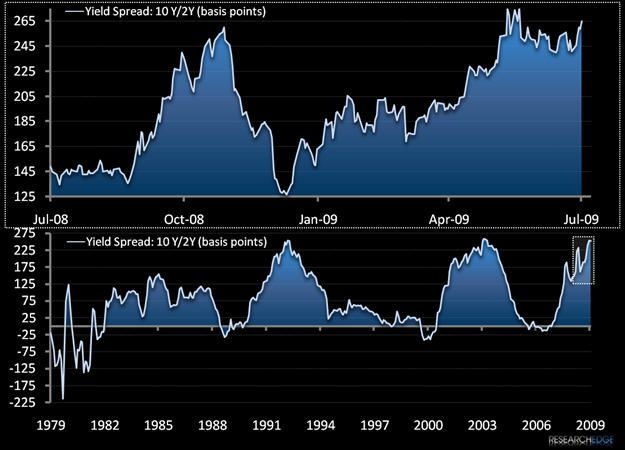
- Top Chart (2008-2009) - the widest that the US Treasury yield curve has EVER been was in June of 2009.
- Bottom Chart (1) – shows you the Greenspan (1993, 2003) and Bernanke (2009) inspired love bubbles.
EVER, of course, is a long time by any economic measure. Into Friday’s US market close, the US Dollar was getting tagged and the yield curve (10’s to 2’s) had expanded to +265 basis points wide, challenging it’s all time high in terms of its spread (+271bps).
For the immediate term REFLATION trade, it’s all good and fine to trumpet this as a positive for both credit and equity markets. It is positive and, in the moment, pigging out at the trough of a fat yield curve provides a bounty for the bankers belly.
The longer term question remains however – how will this all end?
My answer: higher long term cost of capital with tighter/re-regulated access to it. Reflation will morph into reported inflation in Q4, and Bernanke will be left chasing his own tail alongside the long end of the yield curve (which isn’t as politicized as the short end and has already left the barn).
Beware of modern economic theory’s groupthink.
KM
Keith R. McCullough
Chief Executive Officer