Fudge Factors: The Labor Force Participation Rate
Yesterday Howard Penney and Rory Green of the Hedgeye Macro team presented their insight on how significant the decline in the labor force participation rate has been in understating unemployment. To summarize, the marked reduction in labor participation has shaved around 200 basis points off the reported unemployment rate. Said differently, unemployment will need to improve 200 basis points before the unemployment rate begins to move lower. While claims improved sharply this morning, they remain in their YTD range of 450-470k, which is 50-75k above where they need to be for unemployment to improve, suggesting we are still a long, long way off from any meaningful drop in unemployment. The following is taken from their note yesterday.
There are two ways (maybe more) the government can manipulate the jobs data to make things look better than they appear. The first way was highlighted in a post entitled, “FRIDAY MACRO MIXER: THE PAYROLL FUDGE FACTOR”, where I discussed the implications of the Birth/Death model on the credibility (or lack thereof) of the payroll data. As I wrote on Friday, the last benchmark revision released by the BLS indicated that the Birth/Death model numbers were grossly understating job losses and, as such, is not reliable.
The second way the BLS distorts the numbers is through the headline unemployment rate, which is being deflated by changes in the Labor Force Participation Rate.
Since BLS unemployment data begins, 1948, the proportion of the civilian population working or seeking work has generally been growing. This is largely as a result of women entering the workplace and long-term growth in the U.S. economy through the 20th century. The 1950’s saw year over year increases in the labor force participation rate of 210 bps – more than three standard deviations from the mean of all available data (January 1948 to present). Recently, there has been a period of precipitous decline in labor force participation rate, peaking at a year-over-year decline of 120 bps – two standard deviations from the mean – which is important to note.
The chart below details where the unemployment rate would be if the labor force participation rate was at its ten-year average level of 66.1%; for the year-to-date, it has been averaging 64.8%. This implies that many folks are losing heart and dropping out of the job hunt.”


Initial Claims Fall 27k Last Week - Progress to be Sure
Initial claims fell 27k last week to 451k (falling 21k net of the revision). Rolling claims came in at 478k, a decline of 9k over the previous week. Reported claims have moved to the low end of the YTD range of 450-470k that the series has occupied for all of 2010, while rolling claims remain on the high end of the range. This is a big step in the right direction. Ultimately, we are still looking for initial claims in the 375-400k range before unemployment meaningfully improves.
This being said, the reality is that we've seen two better than expected data points in the last two days: yesterday mortgage applications were up 6.3% and today jobless claims were down 27k. For investors interested in how best to play a short-term sentiment reversal on the long side, the table below shows Financial subsector performance over multiple periods. Investors interested in beta exposure may want to consider those subsectors near the bottom of the column on the far right as these are the highest beta names that have come under the most significant pressure since the April 14 high in the XLF.


Short term rallies notwithstanding, our firm remains of the view that US economic growth is slowing markedly between now and into 2011. We think this will keep a lid on new hiring activity as management teams focus on cost control. All of this raises the risks that a prospective slowdown in GDP will precipitate an incremental slowdown in hiring/pickup in firings, which will, in turn, further pressure growth. We continue to look to claims as the best indicator for the job market, as they are real time and inflections in the series have signaled important turning points in the market in the past.
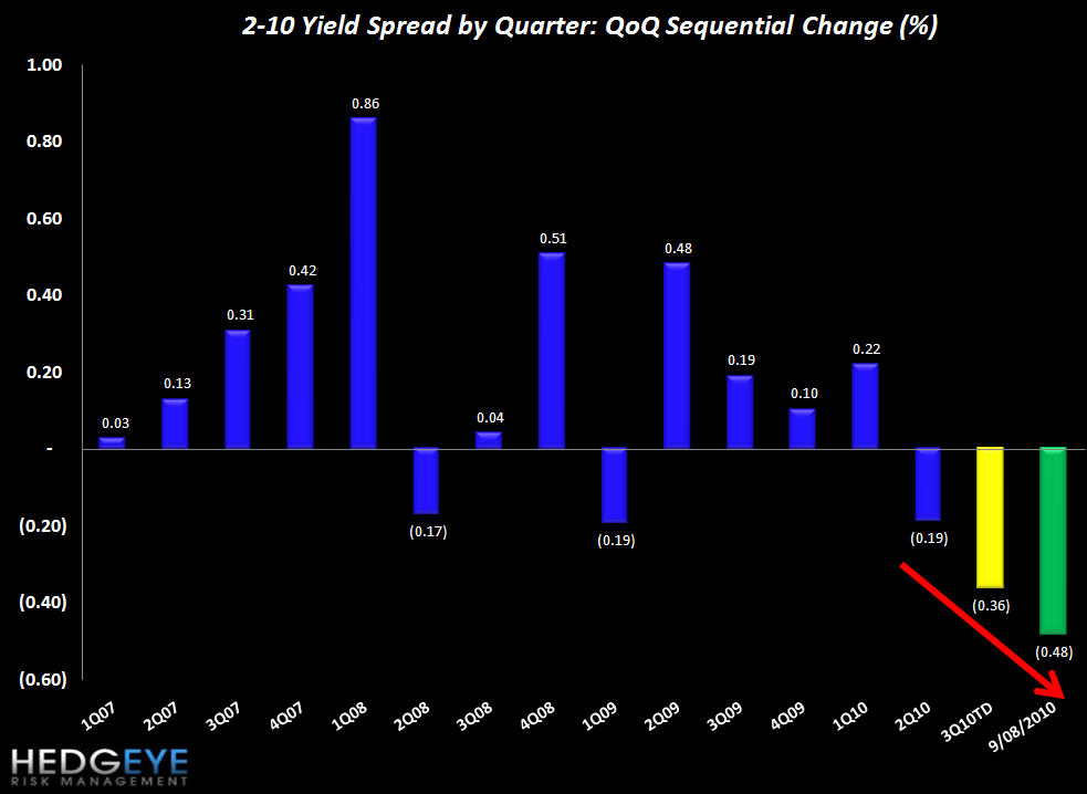
2-10 Spread a Headwind for 3Q Margins
The following chart shows 2-10 spread by quarter while the chart below that shows the sequential change. The 2-10 spread (a proxy for NIM) has been coming under growing pressure in the past two quarters. Yesterday’s closing value of 214 bps is up from 208 bps last week. For reference, 3Q to date is tracking down 36 bps sequentially vs. a sequential decline of 19 bps in 2Q10.

The table below shows the stock performance of each Financial subsector over four durations.

Below we show the correlations between initial claims and each of the 30 Financial Subsectors. We have refreshed this table to reflect prices through the end of July. Using this updated measure, Credit Card and Payment Processing companies remain the most correlated to initial claims, with R-squared values of .63 and .65 over the last year, respectively. Surprisingly, some subsectors show a positive correlation coefficient to initial claims - i.e. Financials that go up as unemployment claims go up. These names are concentrated in the Pacific Northwest Banks and Construction Banks, though these correlations are usually not very high.

Some investors will note that in some cases the R-squared doesn't seem to reconcile with the square of the correlation coefficient. This is a result of finding the correlation and then averaging. For example, Pacific Northwest Banks have an average correlation coefficient of .33 and an average R-squared of .52 (with CACB, CTBK, FTBK, and STSA strongly positively correlated and UMPQ strongly negatively correlated). The different directions have the effect of canceling out each other out when finding the average correlation coefficient, but do not cancel out when finding the average R-squared.
The following table shows the most highly correlated stocks (both positively and negatively correlated) with initial claims. Note that the top 15 negatively correlated stocks have a much stronger correlation on average than the top 15 positively correlated stocks - as you would expect, given that most of the Financial space is pro-cyclical.

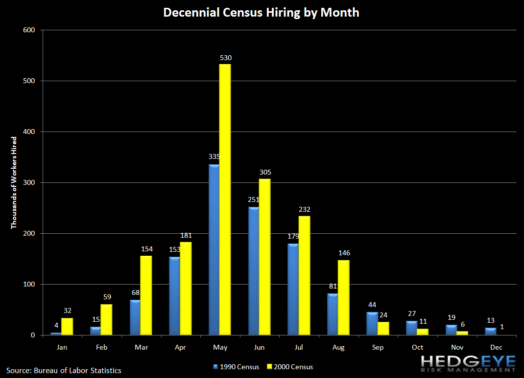
As a reminder, May was the peak month of Census hiring, and it will continue to be a headwind through the end of the month as the Census winds down. After September, it should mostly cease to be a factor.
Joshua Steiner, CFA
Allison Kaptur
