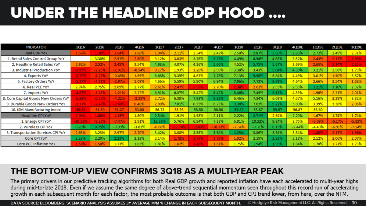
CHART OF THE DAY: A Simple Visual - From #PeakCycle To #Slowing U.S. Economy
03/01/19 08:25AM EST
Editor's Note: Below is a brief excerpt from today's Early Look written by CEO Keith McCullough. Click here to learn more about the Early Look.
|
In the Chart of The Day (slide 30 of the current Q1 Macro Themes deck) we show you point #3, color coding it for rate of change.
Again, simplifying the complex:
- When almost everything was as green as green gets in that chart (Q318), we called that #PeakCycle
- When green goes to lime green and yellow, that’s called #slowing ROC (rate of change) data
- When yellow goes to amber and red lights, you better hope for a lot of #cowbell if you’re levered long
|


© 2025 Hedgeye Risk Management, LLC. The information contained herein is the property of Hedgeye, which reserves all rights thereto. Redistribution of any part of this information is prohibited without the express written consent of Hedgeye. Hedgeye is not responsible for any errors in or omissions to this information, or for any consequences that may result from the use of this information.