"Less than six months into the year, the Fed has been hawkish, pivoted to dovish, pivoted to hawkish and will now pivot to dovish," Hedgeye Senior Macro analyst Darius Dale wrote on Twitter earlier today.
#Truth
Today's #JobsBomb spells trouble for those flippant Fed heads. Here's why.
Stepping back a moment to better contextualize today's Jobs Report in both delta and differential terms, here are two charts from Dale:


Meanwhile...
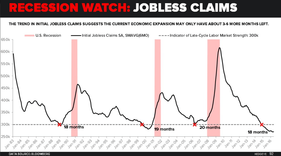
"If you think this heinous Jobs Report is a one-off, you are literally paid to be willfully blind to #TheCycle," Dale writes. Take a look at what Jobless Claims data has long been signaling (i.e. we're about 3-6 months of improving claims data away from recession).
And here's the KEY chart that shows Non-Farm Payrolls rolling off the February 2015 cycle peak in rate-of-change terms (i.e. #NotGood).

In other words, as the linear, labor economists at the Fed continue to witness deteriorating jobs data, it will become increasingly difficult to sell the "all is good" U.S. economic narrative.
In fact, the market is already pricing in a more dovish Fed. Look at the latest implied rate hike probability reading versus where it was yesterday (note the probability of a July rate hike was nearly cut in half in the matter of a day):

We'll take this time to reiterate what we've been saying for a while now...
