CHART OF THE DAY: Where The Big Money Is Made In Macro

05/09/16 07:47AM EDT

Editor's Note: Below is a brief excerpt and chart from today's Early Look written by Hedgeye CEO Keith McCullough. Click here to learn more.

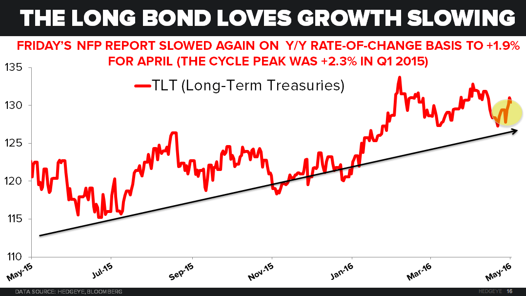
"... With another rate-of-change #slowing in non-farm payroll (NFP) growth for the month of April at +1.9% (vs. #TheCycle peak of +2.3% in Q1 of 2015), the big money in macro that was made last week was right where it’s been made all year long:


  1. Long Bond (TLT) up another +2.1% last week to +8.2% YTD
  2. Utilities (XLU) up another +0.8% last week to +12.8% YTD
  3. Gold up another +0.3% last week to +21.9% YTD"

CHART OF THE DAY: Where The Big Money Is Made In Macro - 05.09.16 EL Chart

© 2024 Hedgeye Risk Management, LLC. The information contained herein is the property of Hedgeye, which reserves all rights thereto. Redistribution of any part of this information is prohibited without the express written consent of Hedgeye. Hedgeye is not responsible for any errors in or omissions to this information, or for any consequences that may result from the use of this information.