Below is the breakdown of this morning's labor data from Joshua Steiner and the Hedgeye Financials team. If you would like to setup a call with Josh or Jonathan or trial their research, please contact
ENERGY JOBS
The jobs market in energy states remains in accelerating meltdown. With energy companies set around year end to lose the last remaining cushion of their previously established hedges, job cuts in the 8 states with the most energy-dependent economies (AK, LA, NM, ND, OK, TX, WV & WY) are blowing out versus the rest of the country. The chart below shows that in the week ending December 5, the spread between the indexed series of claims in energy states versus the indexed series of claims in the country as a whole increased from 47 to 51. That is the largest the spread has been since our analysis' May 2014 starting point.
Last week we were asked why we didn't include the state of Colorado in our 8-state basket. Our response was that our basket was borne out of THIS article, which showed the 8 states with the highest energy-related employment as a % of total as of 2011. We were then sent an interesting paper detailing the exposure of Denver to the oil and gas industry. In a nutshell, 11% of downtown Denver's workforce is employed in the oil and gas industry at an average level of compensation roughly 3x the rest of the workforce. From 2005-2014, one-third of the new jobs created in the downtown Denver area were oil and gas jobs. The point here is that while these 8 states represent some gauge of the fallout from energy's collapse, there are many other areas that are being impacted. If you'd like a copy of the paper (PDF) just let us know.

Apart from the carnage in energy claims, national claims data continues to show that the economy is late stage and the Fed's rate increase yesterday is unlikely to extend the duration of the recovery.
THE BIG PICTURE
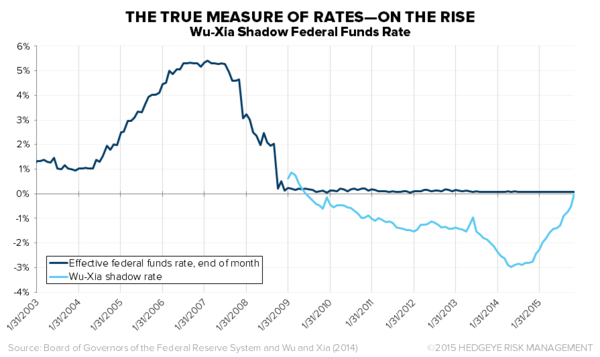
Some might argue that, as the first chart below shows, a cycle usually has significant track left following its first rate hike. However, while the Fed announcement this week marks the first increase in the fed funds rate this cycle, the Fed has actually been tightening policy for some time, ostensibly since late 2013 when it began tapering QE3. The Fed actually quantifies the effect of the current cycle's non-traditional policy action and the tapering thereof in the second chart below with a measure called the Wu-Xia Shadow Fed Funds Rate (HERE). The Shadow Rate is basically the rate the Fed has set by implementing non-traditional policies. The following chart shows that we have been in a rising rate environment since April, 2014 and the effective Fed Funds rate has risen ~300 bps to 0% from -3%. This is one of the main reasons why a) growth is now slowing and b) the cycle is late stage.

The Data
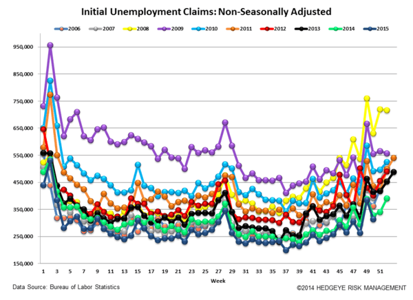
Initial jobless claims fell 11k to 271k from 282k WoW as the prior week's number was not revised. The 4-week rolling average of seasonally-adjusted claims fell -0.25k WoW to 270.5k.
The 4-week rolling average of NSA claims, another way of evaluating the data, was -7.6% lower YoY, which is a sequential deterioration versus the previous week's YoY change of -8.3%


Joshua Steiner, CFA
Jonathan Casteleyn, CFA, CMT
