Editor's Note: This is a brief excerpt from today's Morning Newsletter written by Hedgeye Director of Research, Daryl Jones. Click here to subscribe.
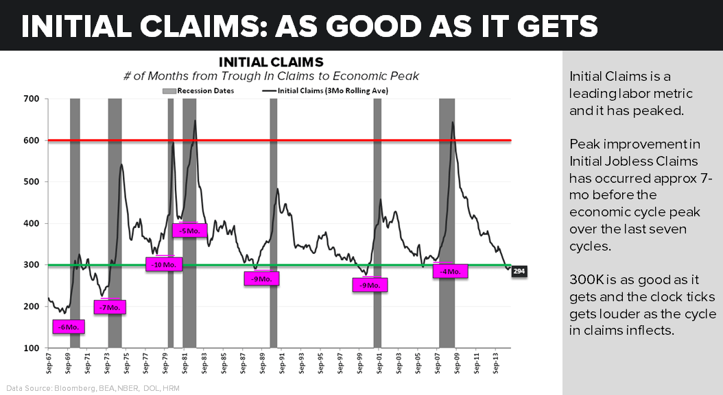
In today's Chart of the Day, we take the longer view of the employment cycle and we show initial jobless claims going back to the mid-1960s. The data in this chart quite clearly shows that if anything we are closer to the peak in the employment cycle than the trough. More interestingly, as the chart also shows, employment improvement peaks, on average, 7 months before an economic cycle does.
