Upside vs. Downside Visualizations (9/12/2023)

09/12/23 02:01PM EDT

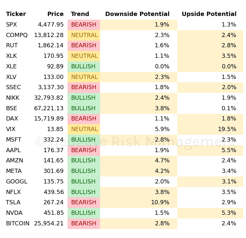
The charts below highlight the Upside to Downside risk using today’s risk ranges and today’s prices. As you get your Real-Time Alerts from Keith you can execute and have these visualizations side-by-side.

Any dot that is red is bearish trend, green is bullish trend, and black is neutral trend.

  • Anything that has a red dot you want to short when it as at the top end of the risk range (at or near the x axis).
  • Anything that has a green dot you want to buy when it as at the low end of the risk range (at or near the y axis).

This is a brief 5-minute tutorial from Macro analyst Ryan Ricci discussing how to execute using these visualizations.

Upside vs. Downside Visualizations (9/12/2023) - equityTable

Upside vs. Downside Visualizations (9/12/2023) - scatterPlotEquity 

Upside vs. Downside Visualizations (9/12/2023) - commodityTable 

Upside vs. Downside Visualizations (9/12/2023) - scatterPlotCommodity 

Upside vs. Downside Visualizations (9/12/2023) - otherTable 

Upside vs. Downside Visualizations (9/12/2023) - scatterPlotOther 

© 2024 Hedgeye Risk Management, LLC. The information contained herein is the property of Hedgeye, which reserves all rights thereto. Redistribution of any part of this information is prohibited without the express written consent of Hedgeye. Hedgeye is not responsible for any errors in or omissions to this information, or for any consequences that may result from the use of this information.