
|
Editor's Note: Below is a complimentary Early Look note written by our Financials analyst Josh Steiner. We are also pleased to announce our new Financials Sector Pro product. Click HERE for further in-depth research. |
“Inflation is an increase in the quantity of money without a corresponding increase in the demand for money, i.e. cash holdings.”
- Ludwig von Mises
Most investors, let alone ordinary folks, don’t know the name Richard Cantillon but he was a successful Irish-French merchant and banker who lived from 1680 to 1734, and was arguably the father of modern political economy, i.e. the first modern economist.
In 1730, Cantillon authored a paper entitled Essai sur la Nature du Commerce en General, which translates to Essay on the Nature of Trade in General. In it, he described something now known as the Cantillon Effect.
The Cantillon Effect describes the process by which printed money is circulated into the economy. Cantillon argued that when money is printed, the circulation of that new money is not neutral, not fair, not evenly distributed. Rather, in Cantillon’s day, your personal benefit from money printing depended on how close you were to the King. The closer you were, the greater the benefit. The further away, the greater the harm.
To illustrate, he used the metaphor of water vs honey. When water is poured into a glass, it distributes evenly almost instantaneously. However, when honey is poured into the same glass, it begins by accumulating in the center and then, slowly, it spreads out to the rest of the glass. Such is the transmission mechanism of money printing.
Applying this framework, one interesting observation Cantillon made, over 250 years ago mind you, is that when money is printed, the first thing to happen is that asset prices rise. He noted that this happens very, very quickly and has to do with the excess money being concentrated among the wealthy suddenly chasing after a fixed supply of assets like stocks or land.
Consider today’s analog to what Cantillon postulated two and a half centuries ago.
- S&P 500 prices have risen by the most in the trailing 16months since at least 1978 (+93% through 7/20/21).
- US home prices have risen at the fastest Y/Y rate in history (+15.7% through April).
- M2 growth was recently as high as +27% in February (the fastest pace of M2 growth since at least 1982) and is currently +13% Y/Y through May.
This could also be thought of/explained as a swift rise in M2 with a corresponding plunge in velocity. There is more money, but it is not being spent; rather, it’s being hoarded and just sits for a time, not being distributed.
Cantillon went on to observe that after the prices of assets have risen substantially, money then begins to spread out across the economy, like the honey slowly making its way out from the center toward the edges of the glass. This process then creates broad-based price inflation.
Now, just over one year removed from the start of operation warp speed money printing, we have begun to see meaningful acceleration in reported inflation. Again, consider the recent data.
- Headline CPI just hit +5.4% Y/Y – the fastest rate of price growth since 2008.
- Core CPI just hit +4.5% Y/Y – the fastest rate of price growth since 1991.
- CPI, Energy just hit +24.2% Y/Y - the fastest rate of price growth since 2008.
Finally, Cantillon observed, only after both asset prices have risen significantly, and broad-based inflation has taken hold, then will laborers see their wages rise. However, the rise in wages will not be of the same magnitude as the asset price growth or the broader inflation, and, of course, will occur on a considerable lag.
This dynamic has the effect of creating greater wealth disparity between those who own assets and those who do not. For those who are not already asset owners, owning assets becomes even further out of reach. Moreover, for those who do own assets, they can use low-cost debt to purchase more assets early in the money printing process.
Back to the Global Macro Grind…
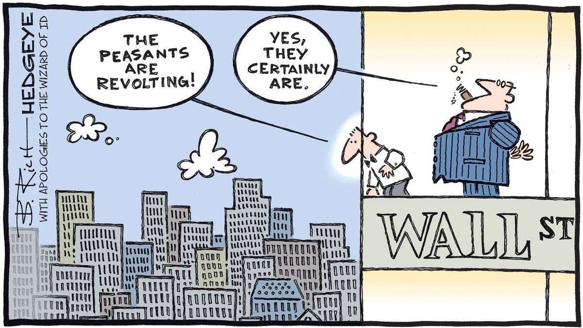
This is not just some theory from over 200 years ago. It is evident in the net worth differential seen among the top 1% and bottom 50% of US Households. From July 1989 to January 2021, the bottom 50% of Households saw their collective net worth rise 243% from $761 Billion to $2.62 Trillion (an increase of $1.86 Trillion). Meanwhile, the top 1% of Households saw their collective net worth rise 769% from $4.78 Trillion to $41.5 Trillion (an increase of $36.7 Trillion). In other words, in comparing the delta change in net worth between the Top 1% and Bottom 50% from 1989 to present, 95% of the $38.5 Trillion nominal increase has accrued to the Top 1% of households, while 5% has accrued to the bottom 50% of households.
This is the Cantillon Effect of modern-day monetary policy. Ironically, the current administration, Fed Chairman and Treasury Secretary all consider their combined monetary and fiscal stimuli a positive as they are causing unemployment to ease and lower-income wages are beginning to rise; all while largely dismissing the other effects – skyrocketing asset prices and the fastest inflation since 1991, which is serving only to widen the Top 1%/Bottom 50% divide.
One interesting omission from the above list of rapidly inflating costs is that of shelter, which happens to be the largest single portion of household expense. Shelter costs account for one-third of the total consumer price basket.
Remarkably, even with the fastest rate of home price growth ever, Shelter CPI accelerated a mere 40 bps to 2.6% Y/Y in June. As recently as February, the Shelter component was higher by just +1.4% Y/Y. This is despite home prices being higher by 12.5% Y/Y in February.
Shelter is comprised of two components. Two-thirds of Shelter is OER, or owners equivalent rent, while one-third is actual rent. Let us first consider OER.
First, what the heck is OER? Prior to 1982, the Bureau of Labor Statistics considered housing, specifically home prices, to be part of CPI. However, in 1982 the BLS decided it was not part of CPI. Why? The BLS determined that CPI should only measure consumption goods and housing, it argued, is not a consumption good, it is an investment good. Therefore, the BLS decided to replace home prices with something called owner’s equivalent rent. The purpose was to serially understate CPI because CPI’s real purpose is to index government benefits.
Consider the decoupling over the last 30 years. Since January 1990, the FHFA home price index has risen by 231% (through April 2021). Over that same period, OER has risen by 148%. If we converted that to nominal terms, that is the equivalent of a home that cost $100,000 in 1990 today costing $331,000, but the government says it only costs $248,000. That is a significant delta, especially on the largest single expense the average household bears.
So, we know that the BLS has serially understated OER – the calculation of which is based on a survey of people guessing what they would pay to rent the home in which they live – for years. Nevertheless, the OER component has shown a strong directional correlation – even if at a (much) lower relative amplitude – but on a significant lag to actual home prices. We illustrate this relationship on page 64 of our latest Macro Themes presentation. The bottom line is that the OER component of Shelter CPI is poised to accelerate meaningfully.
This means that even if other areas of cost are disinflating on the margin, the single largest component of CPI is poised to accelerate meaningfully.
Shifting gears, a view we hear from competitors is that home prices have reached comparable levels of unaffordability as was seen in 2006 – the peak of the housing bubble that, along with non-existent underwriting, precipitated the Financial Crisis of 2008. The data shows this to be wholly untrue.
The median US monthly rental payment, according to the Census HVS survey, was $1,226/month in 1Q 2021. This compares with a mortgage payment of $1,184 to purchase the median existing home in the US at the same time. That equates to a ratio of 97%. In other words, the median person considering whether to rent or buy at current prices would today find the cost roughly comparable. By contrast, in the heady days of 2005-2006, it cost roughly twice as much to buy vs rent at the median.
Alternatively, if we consider the mortgage payments needed to buy the median existing home today ($1,184) and compare that to the median after-tax income ($4,555), we find the ratio to be 26%. Back in 2005-2006, that percentage was over 40%.
The argument that we are at or even near the dawn of a deflationary era for housing costs simply does not hold up.
Now let us consider rents. The CPI treats rental costs not dissimilarly from how it treats the cost of buying a home. The BLS says that the median cost to rent has risen 149% from January 1990 to January 2021. However, the Census HVS survey shows that median asking rents have risen by 233% over the same period. Again, that is a very large delta, and one that also clearly understates the shelter cost component of CPI relative to reality.
What is perhaps more interesting still is the magnitude of the recent delta between these two series. Census data shows the year-over-year increase in median asking rents from Q1 2020 to Q1 2021 is higher by 17.8%. However, the CPI Rent component shows just 1.9% year-over-year growth. That is a delta of comparable magnitude to the LTM OER divergence (+15.7% Y/Y home prices vs +2.2% Y/Y OER).
To put that in context, if housing costs were accurately reflected in CPI, holding all other components constant, the headline print for June would have been 10.1% rather than the reported 5.4%.
As with OER, CPI rents do tend to follow directional reality (although not amplitude), though on a lag.
The takeaways here are twofold. First, the BLS inflation calculations bear little resemblance to reality (BLS = Bureau of Liar Statistics), as we have endeavored to illustrate with the largest single component of the calculation being underrepresented in the headline number to the tune of almost 500 bps. Second, despite this, the directional dynamics of the Shelter component of CPI generally comport with reality, albeit on a sizeable lag, i.e., ~12months. This augurs for sticky high inflation over the coming year as the Shelter piece is poised to offset any cooling off in other areas.
This is one of the principal factors in our thoughts and positioning around Quad 3 stagflation.
To learn more about my team's investing research product Financials Sector Pro click here.
Immediate-term Risk Range™ Signal with @Hedgeye TREND signal in brackets:
UST 10yr Yield 1.18-1.48% (bearish)
SPX 4257-4420 (bullish)
RUT 2112-2244 (bearish)
NASDAQ 14,264-14,851 (bullish)
Tech (XLK) 147.59-153.64 (bullish)
Energy (XLE) 46.12-54.76 (bullish)
REITS (XLRE) 45.21-46.95 (bullish)
Shanghai Comp 3502-3590 (bearish)
Nikkei 27,339-28,537 (bearish)
VIX 14.01-22.13 (bearish)
USD 91.51-93.13 (bearish)
Oil (WTI) 66.01-77.98 (bullish)
Nat Gas 3.58-3.99 (bullish)
Gold 1791-1839 (bullish)
Silver 24.85-26.26 (neutral)
To your continued success,
Josh Steiner
Managing Director

